Brand Visibility.
Visible, Recognisable, Desirable

by Tony Nunan
The word ‘iconic’ is often bandied around with reference to pack design – and it is frequently overused. Genuine icon status, such as is attributable to the Coca-Colas, McDonalds, Nike and Marlboros of the marketing world is not just a function of their distinctive design. It accrues from the fact that these brands have become absorbed into the fabric of our culture and have come to represent an idea or set of values that transcends the sum of their marketing parts.
What most commentators actually mean when they describe a brand as being iconic is that it is easy to recognise. This is, in itself, hugely valuable. Being easily recognised by customers, whether on-shelf or online, is a pre-requisite for converting shoppers into buyers.
At Visuality, we’ve identified 5 points to create and maintain brand recognition:
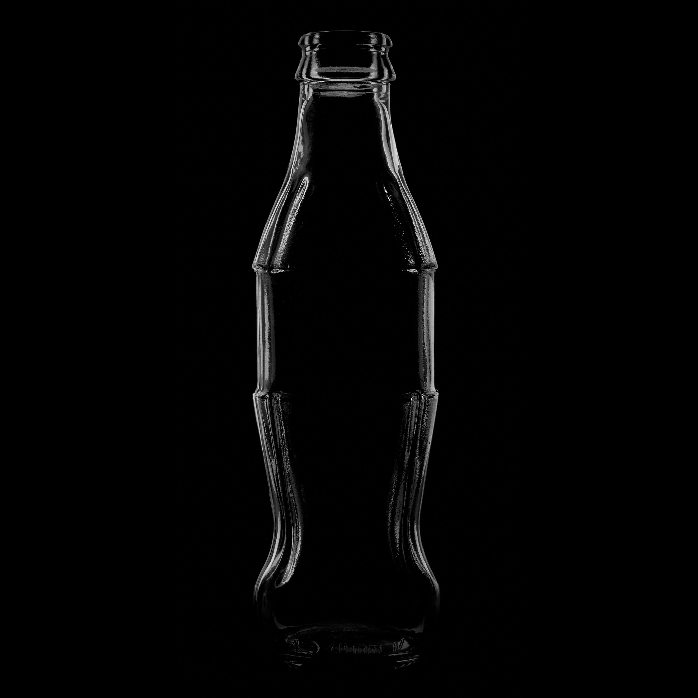
- Vision. Every brand has to start somewhere. The famous Coca-Cola contour bottle is 103 years old. It was created by the Root Glass Company of Terra Haute, Indiana in response to a challenge to bottle suppliers to create a “Bottle so distinct that you would recognise it by feel in the dark or lying broken on the ground.”
Coupling a clear brief with a strong vision is a great starting point when it comes to forming a truly distinctive brand.
- Evolution not Revolution: This is grounded in cognitive psychology. Shoppers learn to recognise brands rapidly yet subconsciously using a small number of visual cues – colours and/or shapes – which anchor the brand in the consumer’s subconscious. We call this a brand’s ‘visual mnemonic’. If these are removed or radically changed this may seriously compromise brand recognition. The cues that drive recognition for many brands may be self-evident; however, for other brands they may be less obvious as it’s not always the logo. When working on an in-store project for Gordon’s Gin many years ago, it became clear that shoppers had learnt to identify the brand using a short black strip at the bottom of the label. Unfortunately, this strip had been removed in a pack redesign, rendering the brand invisible to regular users. It was quickly replaced and can still be found on labels across the Gordon’s range, even though the overall pack and label shapes have been radically redesigned several times since.
- Research Your Assets: Identify the drivers behind your brand. If you don’t know for certain what’s driving brand recognition, don’t just guess – find out. Brand recognition is a sub-conscious process; individuals are unaware of the design elements that drive recognition, so conventional techniques like interviews and focus groups can often be misleading. Specialist techniques are needed to reach into the shopper’s subconscious to identify those specific design cues that are doing all the heavy lifting.
- Consistency is Key. Having a disciplined approach to brand visuality can be tremendously empowering. As part of its Redvolution strategy, Nescafé defined its visual identity as comprising three elements: the accent found above the last e in Nescafé, the red Nestlé mug (itself usually described as iconic) and the ‘hub’ – an oval shape derived from an aerial view of the coffee mug. These elements form a palette for all Nescafe visual communication across 180 countries. Far from constraining creativity, this has led to some fantastically innovative campaigns, such as sampling free coffee in morning newspapers via fold-flat, waterproof red mugs.
Owning a well-defined visual identity can also facilitate an active new product development programme. Cadbury’s ownership of purple has enabled the brand to launch a wide raft of successful new products, including co-branded products leveraging the equity vested in other Kraft brands such as Ritz, Oreos and even Philadelphia soft cheese.
- Respect is Due: Successful brands own colour and shape. These are the brand’s crown jewels – look after them. By all means take them out and polish them from time to time, but treat them with respect. If you’re not fully sure which elements of your brand design are actively driving recognition, hurry up and find out, but make sure you use the right research methods.
The more you use colour and shape consistently across brand communications, the harder they work for you as their association with your brand becomes reinforced in the consumer’s subconscious.